Economy Car Rentals
UX/UI Website Redesign
EconomyCarRentals.com is a global car rental platform that partners with major providers to offer affordable rental options in over 160 countries. It emphasizes competitive pricing and no hidden fees, making it a convenient choice for travellers. However, the website’s outdated UI/UX design undermines its credibility and usability. A cluttered interface, lack of clear visual hierarchy, and an overwhelming booking process create friction for users. Poor mobile optimization, confusing insurance policies, and an inconsistent navigation structure erode trust and may lead potential customers to abandon their bookings. As a skill-building project, I decided to modernize its design and user flow for an overall better experience.
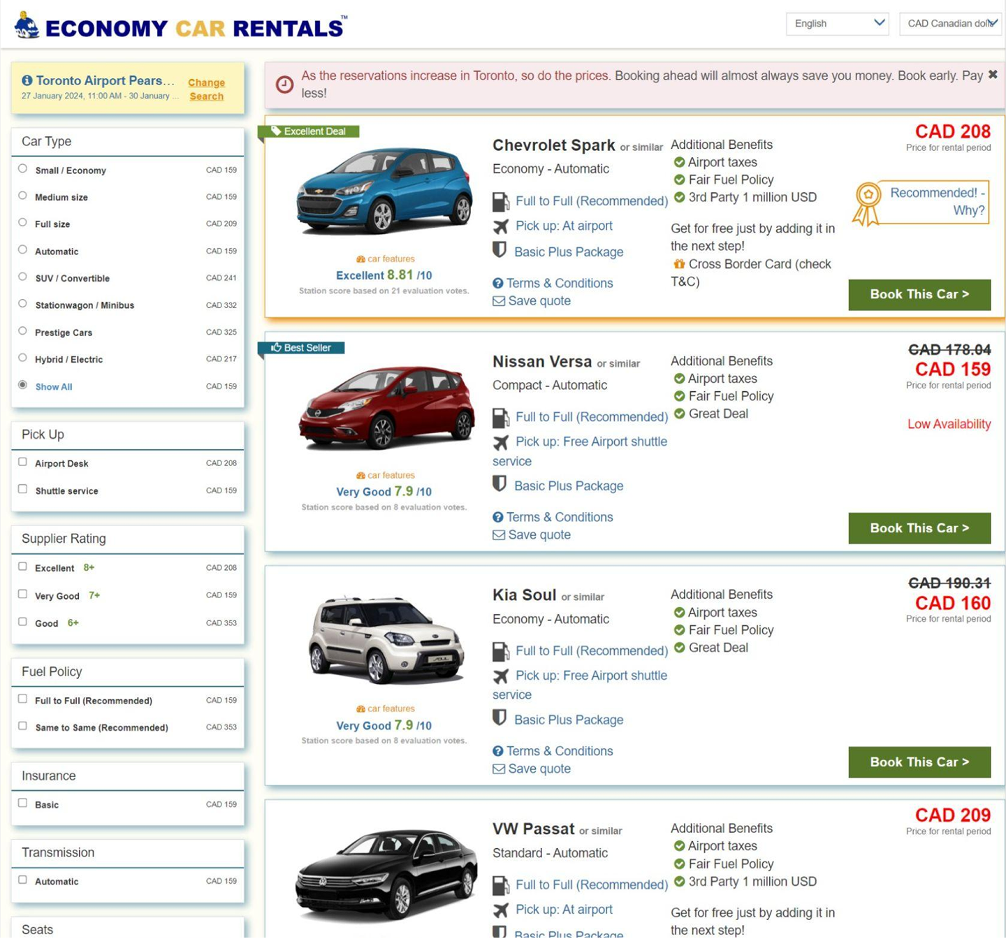
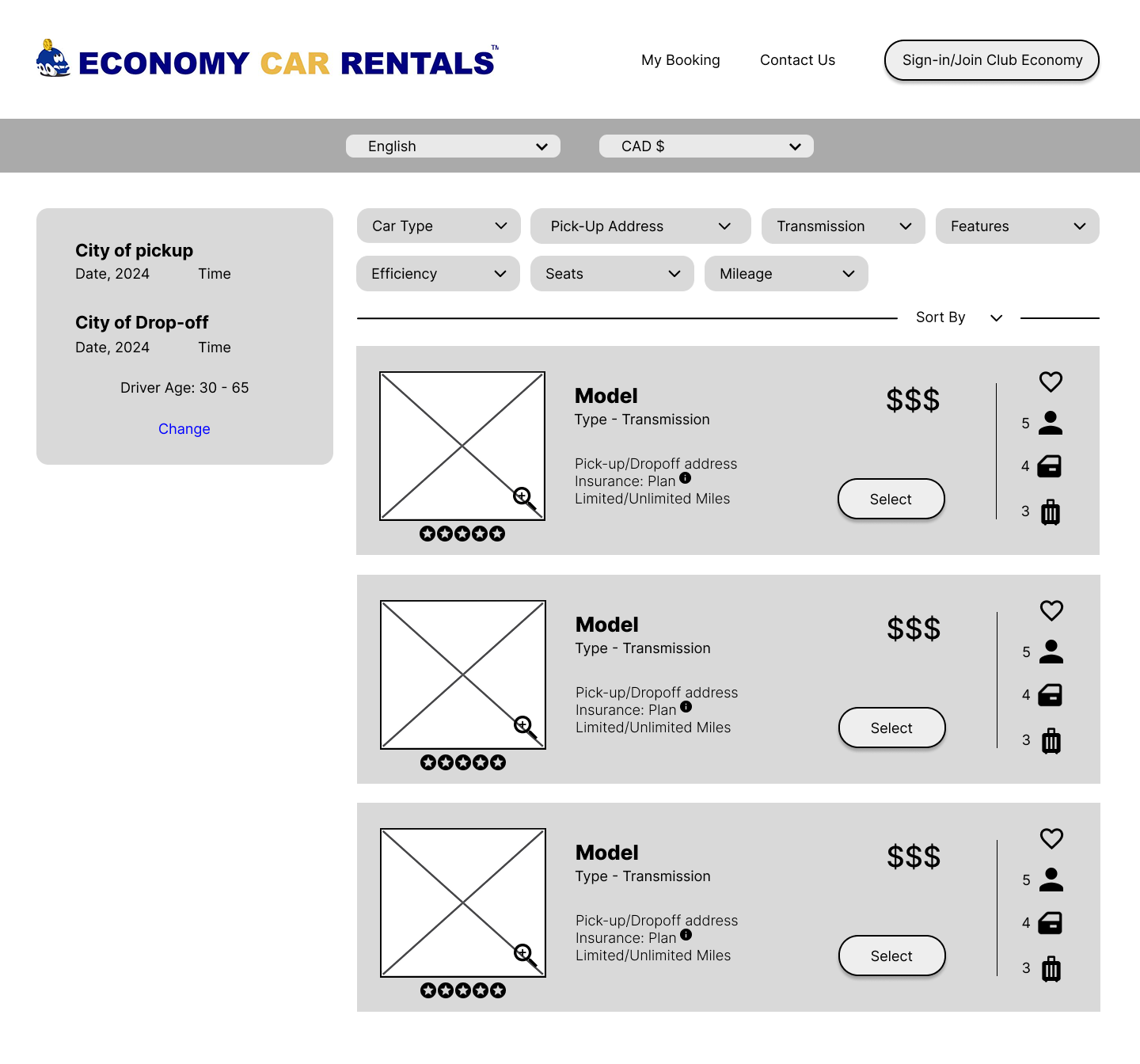
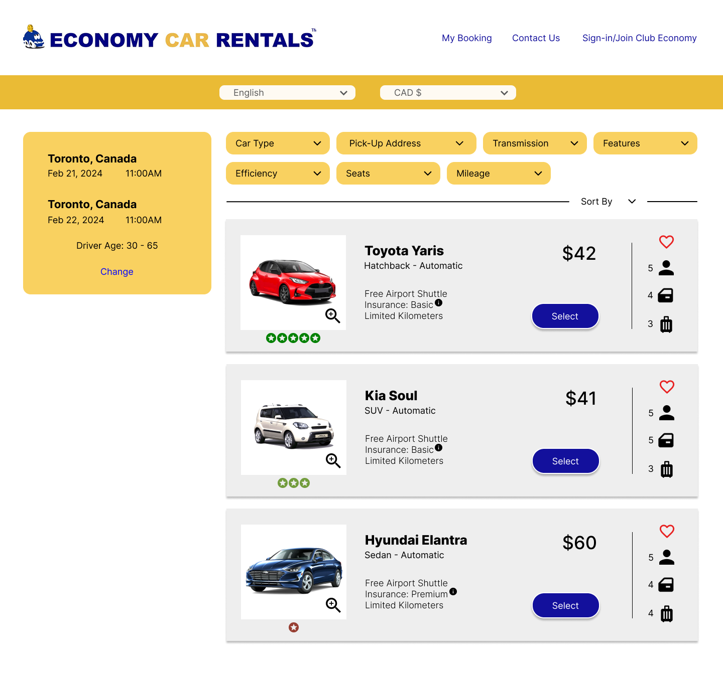
Evolution of an original page to high-fidelity redesign (shown here: listing page).
Notes of initial observations are taken for existing web pages in order to identify potential issues and help guide the research process.
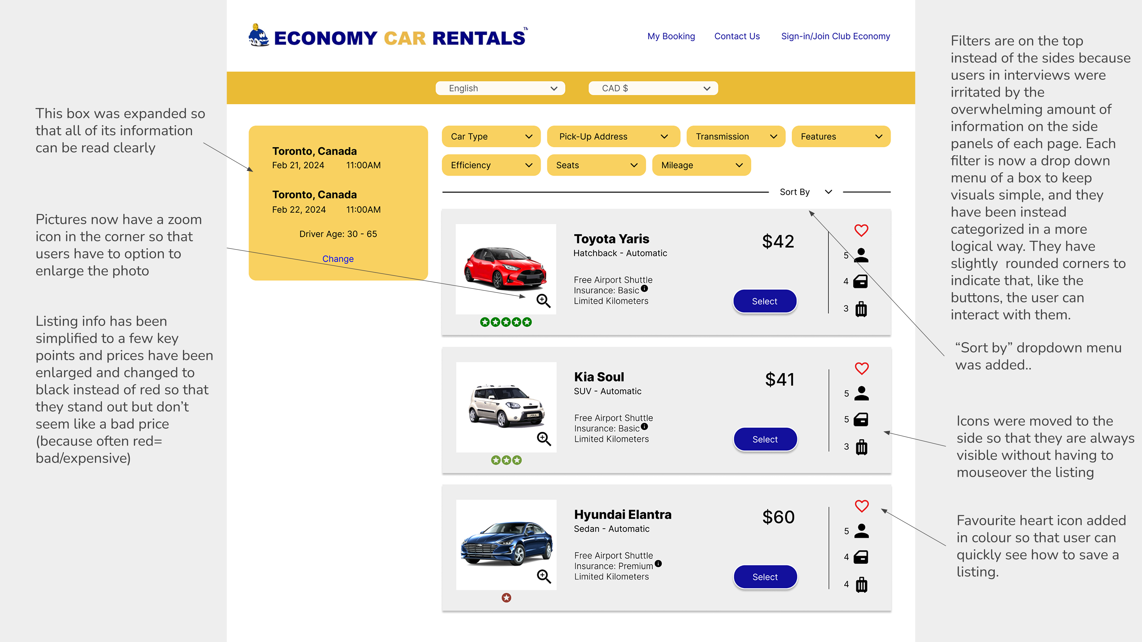
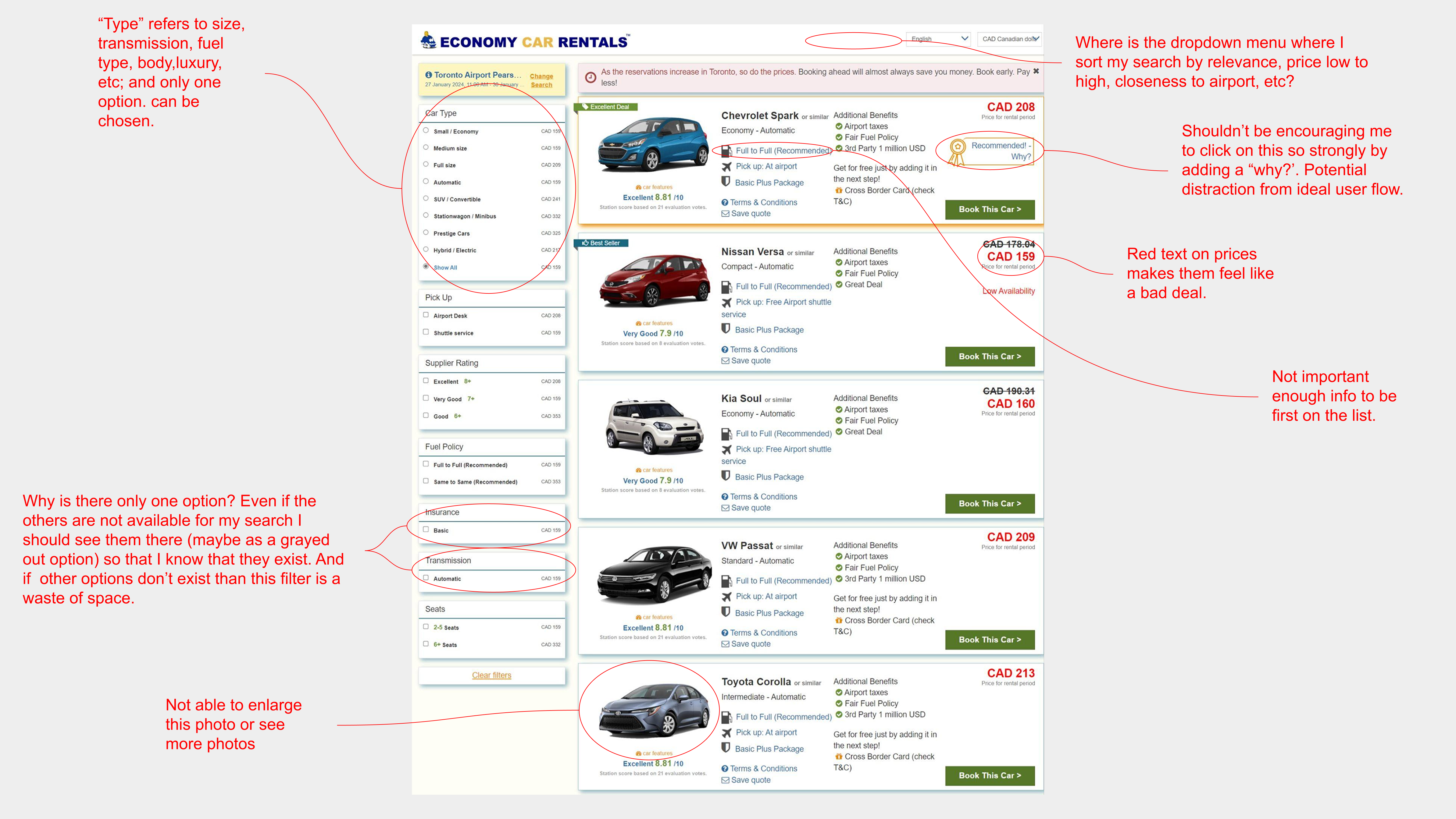
Annotated final results justify design decisions based on information gathered from user interviews and feedback from peers.
Research Goals:
- What are the most common questions that drivers ask about the rental process?
- What frustrates drivers most about renting a car online?
- How might we prioritize the most important/relevant information and reduce cognitive overload?
Interview Questions:
- What frustrated/confused you most about the process of renting a car on this site?
- Is there anything that you felt was distracting or redundant?
- What information do you want to see at a glance on a rental car listing?
- What did you like about the process of renting a car on this site?
Main Pain Points:
- Difficult to quickly scan information because there is way too much text that is styled the same and/or repeated.
- Can’t easily find address of pickup or dropoff locations.
- Insurance coverage information is not organized in a way that can be upgraded or understood in detail.
- Too many side panels.
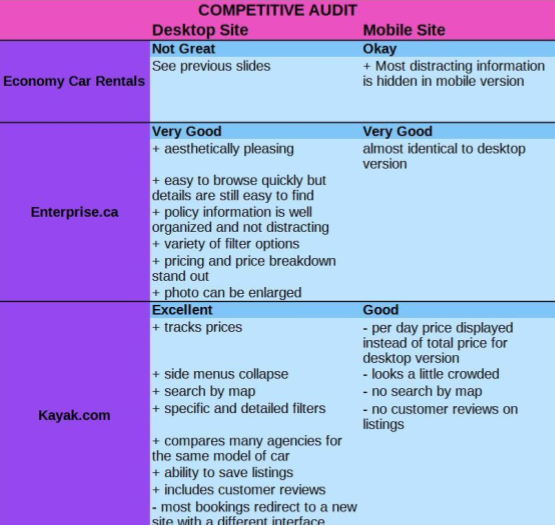
A brief competitor analysis helped to get a clearer picture of user expectations and inspire solutions based on approaches that work for similar companies.
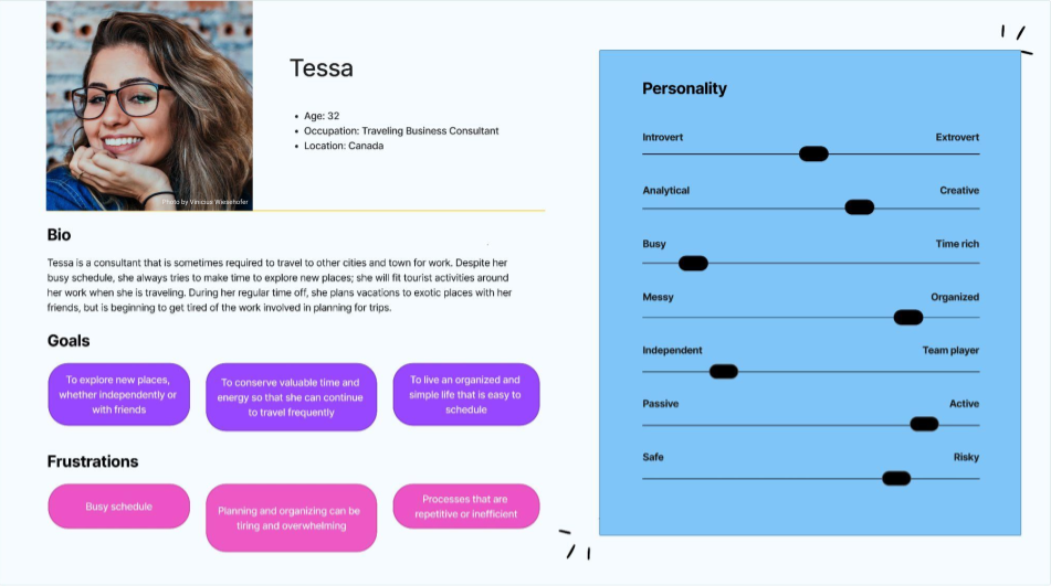
After conducting interviews, a user persona was created to encapsulate the general desires and motivations of the target audience.
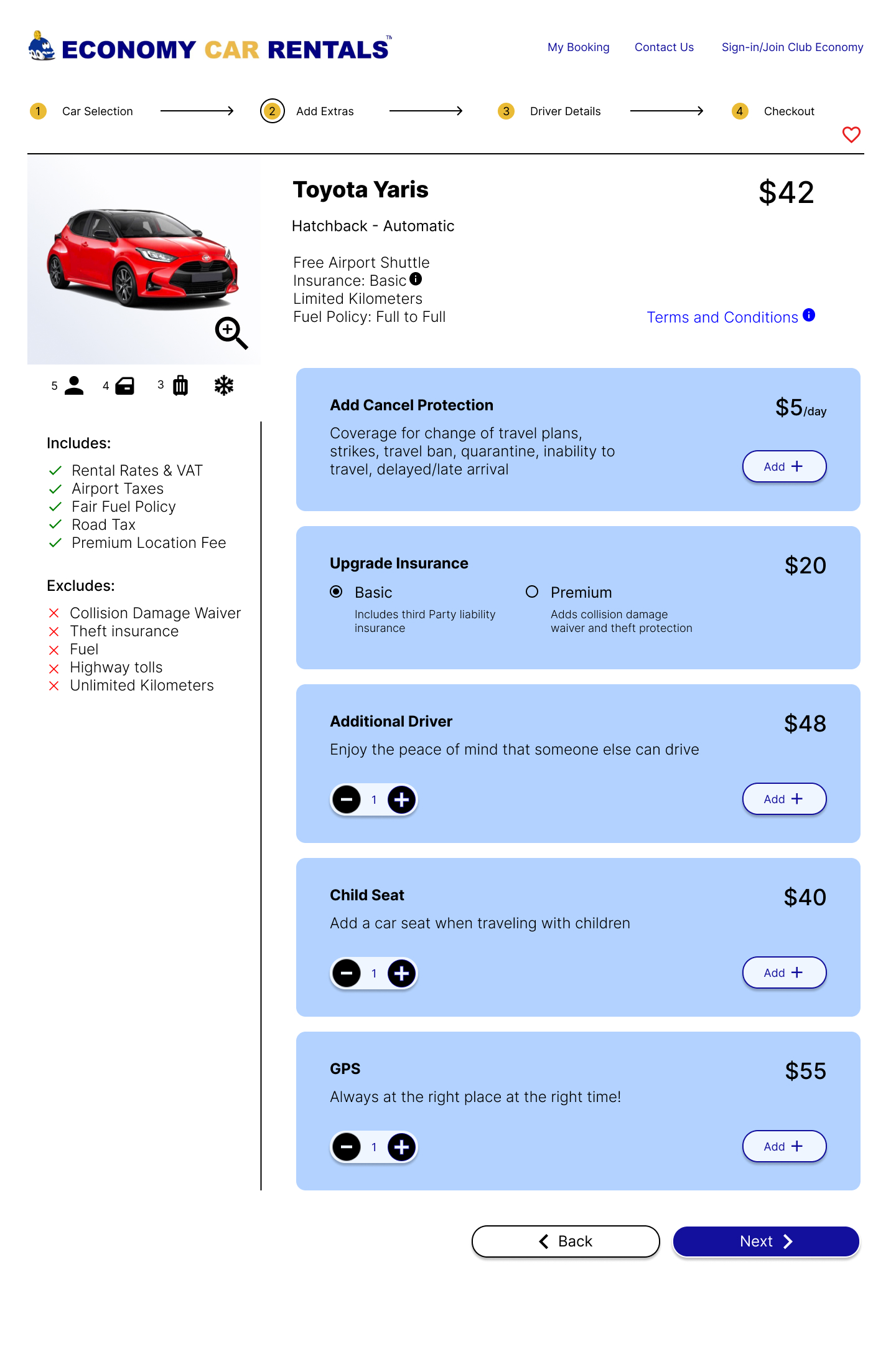
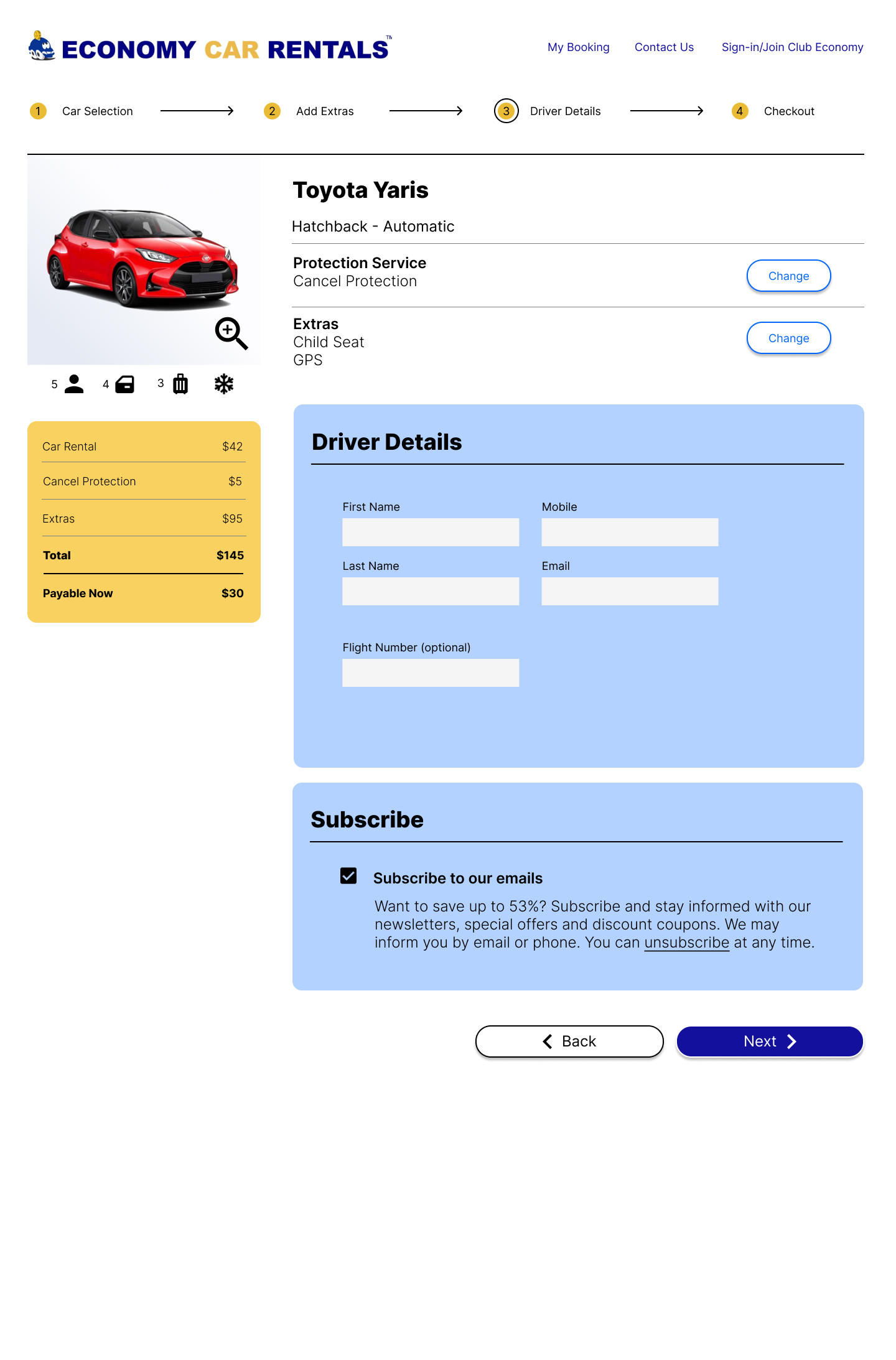
The redesign allows user to finish the car rental process much more quickly and intuitively than the original, as the UI focuses on prioritizing key information and logical organization to reduce visual clutter.
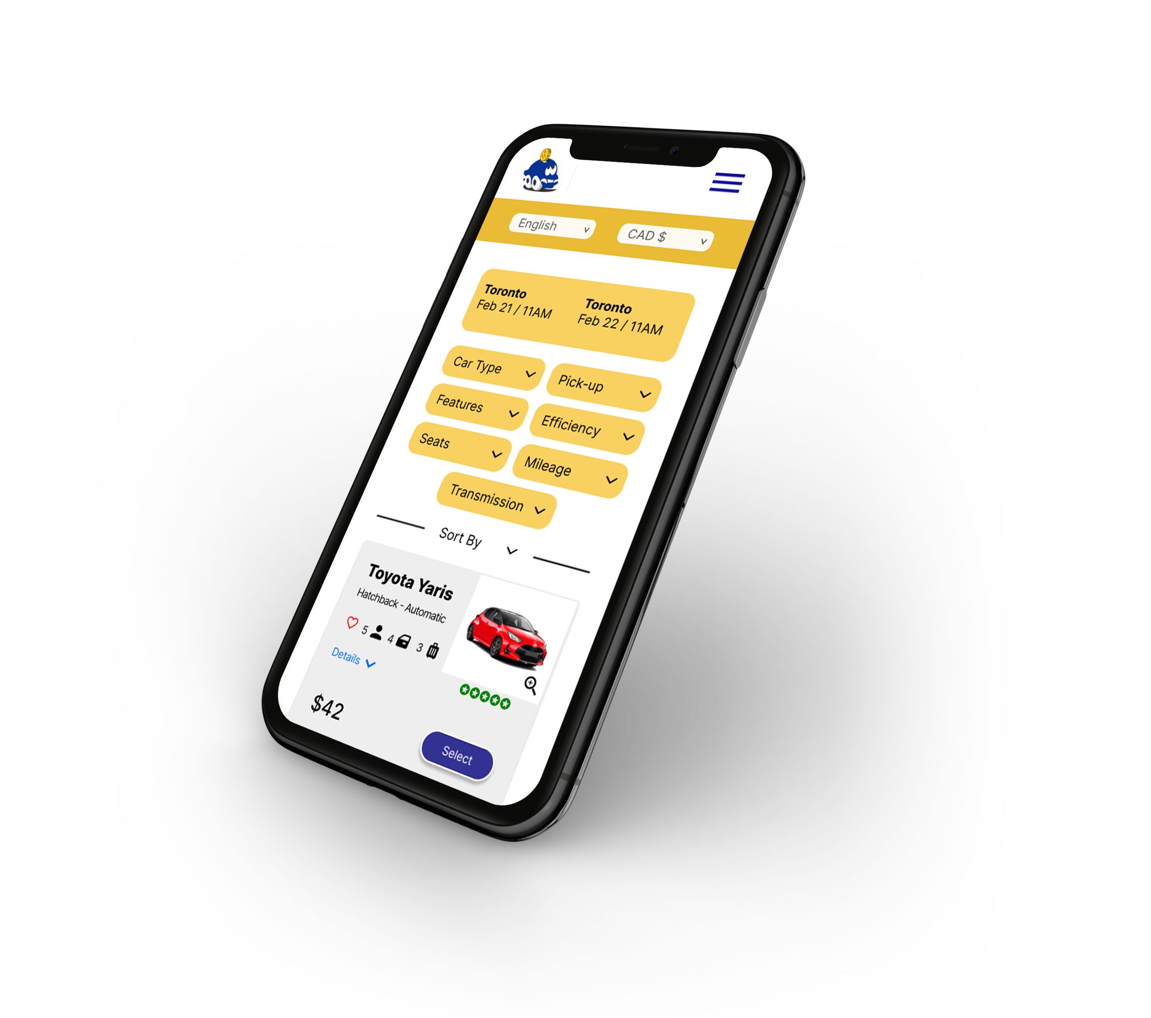
Tweaks to the mobile version allow for an equally user friendly experience on mobile phones.
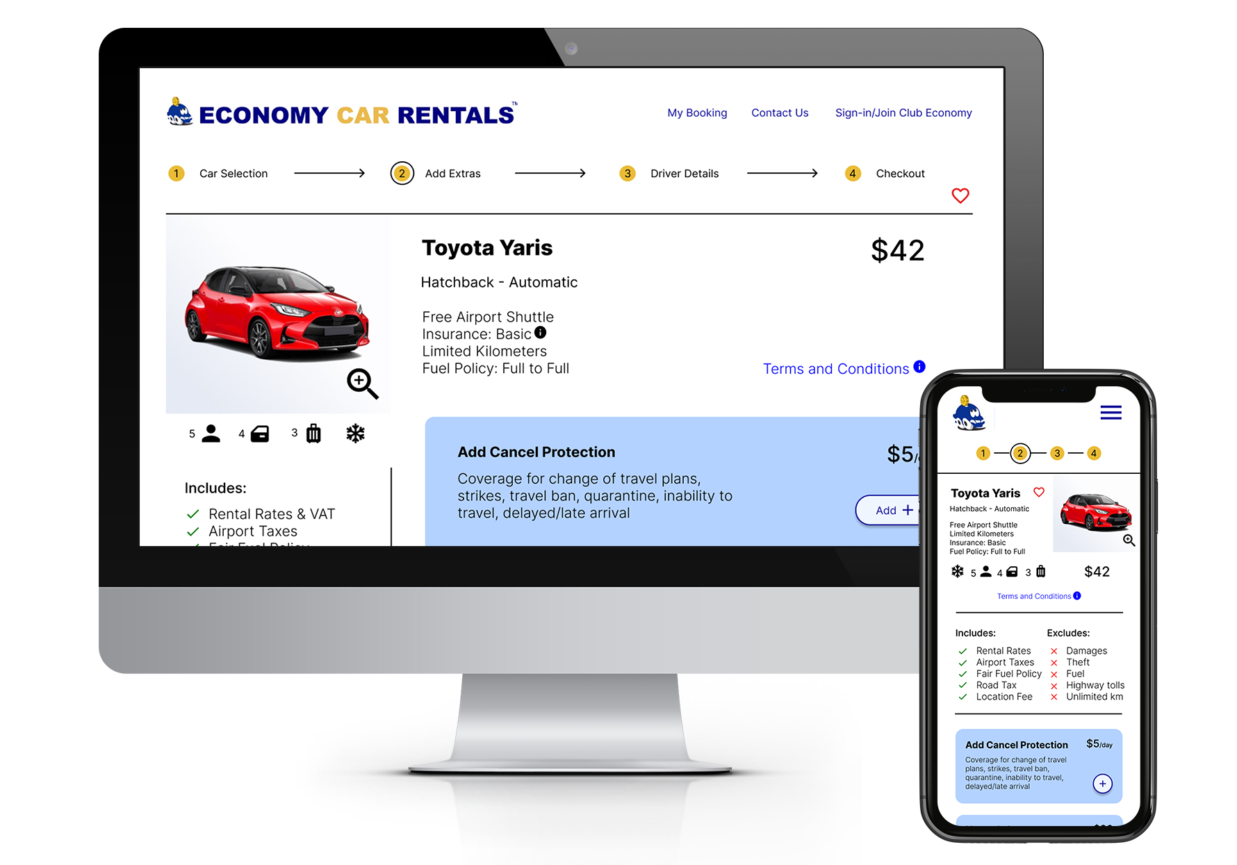
The finished product is clear, concise, and consistent across devices.